
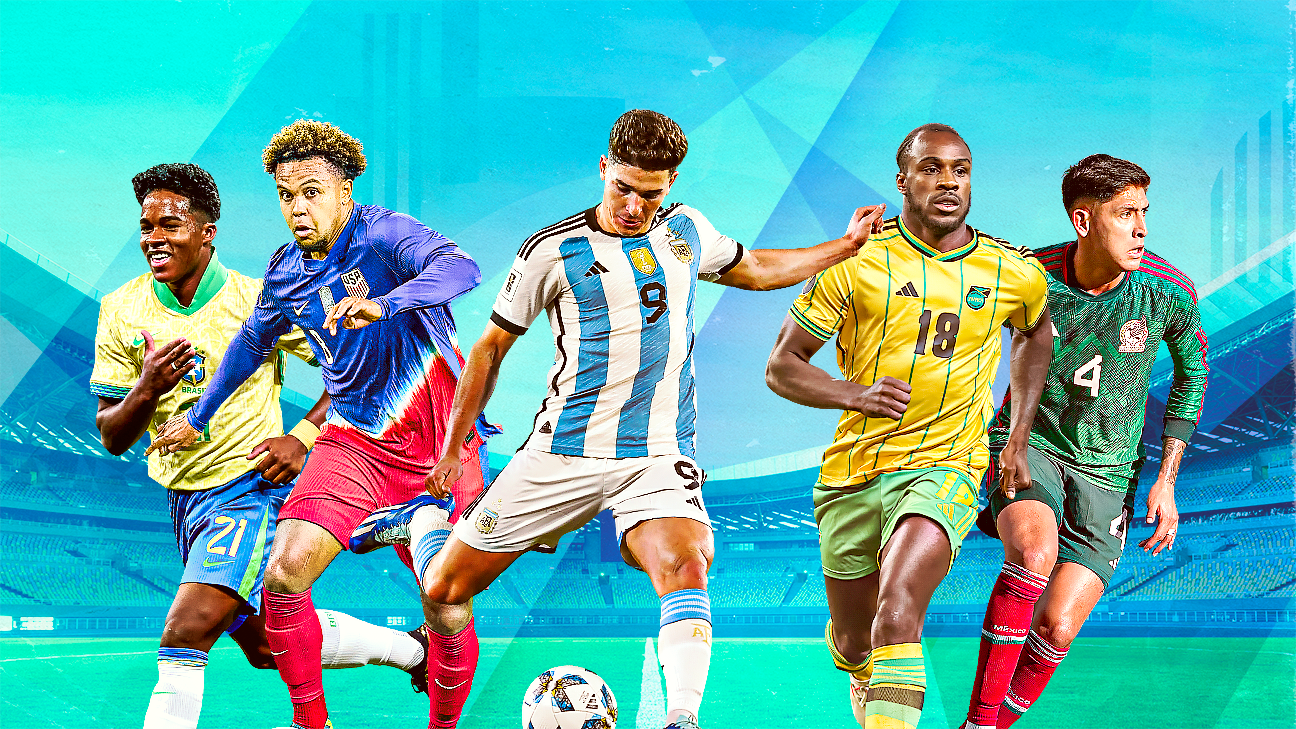
Copa América kit ranking: Which team looks best this summer?
Open Extended Reactions
The Copa América is almost upon us, and as teams from CONMEBOL and Concacaf compete to be named the best international side in the Western Hemisphere, there's another important fight being waged on the field: a battle of fashion.
Editor's Picks
- Ederson, Dybala, Neymar: The best XI not going to the 2024 Copa América2dTim VickeryCopa América: Bracket and fixtures schedule for finals7dESPN2024 Copa América: Final squads from Mexico, Argentina, USA, more2dESPN
2 Related
International kits are laden with metaphors and imagery to inspire patriotic support (a reliable revenue generator) from each country's fan base. Everyone wants their team to look cool on the field. And if their team does, those fans probably think they'd look cool wearing the same thing.
Cynicism aside, this is an international tournament, so it's about national identity, and kit design is one more element of that. And while there are a few outright flops in the 2024 Copa América kit pool, there are also several shining triumphs, which we've helpfully ranked for you below.
16. Chile (Adidas)(Photo by NICOLAS TUCAT/AFP via Getty Images)
Inspired by Chile's "red sea" of fans, the primary jersey looks like it was ordered from the team section of a generic online catalogue. Although the mosaic on the front forms the star from nation's flag, it's difficult to make out and instead, the top looks like it's one of the old template shirts where every country with Nike or Adidas got the same design in different colors.
Adidas
If you thought Chile's primary looked generic, then the secondary is practically invisible. Every third high school in the United States has this jersey. In fact, the writer of this piece had an incredibly similar design when he played high school soccer in upstate New York.
15. Colombia (Adidas)Adidas
It is yellow, and therefore it completes the requirements for a Colombia shirt. But I've seen plenty of far more interesting takes on the Colombia home shirt, and the side panels -- intended to represent the "mesmerizing rhythm of the Caribbean Sea" -- that provide any sort of interesting design end up looking like a bizarre heat map. Not their best foot forward.
Adidas
This kit comes with a smoky pattern on the front to represent how quickly the memory of it will vanish from your brain. It has the colors, uniqueness and impression of a Spirit Halloween. There is already a temporary fireworks store trying to set up shop in this jersey.
14. Panama (Reebok)Panamanian Football Federation
Panama's primary is mostly just a red jersey. There is a pattern embossed on the shirt to give it some visual flair, but the pattern itself doesn't feel particularly special. It's supposed to be inspired by the sombrero pintado, or "Panama hat" -- a hat woven from palm leaves, agaves, peach palms and reeds -- but that representation is broad at best.
Reebok
A secondary that's the same as the primary, but white. It's fine; just boring. If Reebok really wanted to make a splash here, it could've made the V-pattern a darker color instead of the embossed look to give this jersey a much stronger representation of the sombrero pintado.
13. Uruguay (Nike)
We're a little harsh on these kits, which showcase the historic color given Uruguay's nickname (La Celeste, meaning the Sky Blue) and provide some nice accents on the collar. But it ends up looking a bit too much like a Manchester City knock-off for our taste.
Similar design, just a different base color. See above entry, but substitute "Real Madrid" for "Manchester City."
12. Venezuela (Adidas)Adidas
An iconic look, the Vinotinto's kit is perfectly fine all around and should satisfy any Venezuelan supporter out there. It's not the most exciting kit by any stretch, but it gets points for the unique color among this group.
Adidas
This is where Venezuela loses most of their points. We're not entirely sure this paint-splash stripe thing across the chest wasn't lifted from a late-'90s Windows logo.
11. Paraguay (Puma)@PUMAParaguay
If you couldn't tell, South America is big on steady, iconic looks. The red stripes of Paraguay is a good example, although this one ends up seeming a bit more generic than other primaries.
(Photo by Raul Sifuentes/Getty Images)
Paraguay's secondary is a bit of a swing with its print that is inspired by the country's ties to its natural environment and rainforests. Alternatively, this could be a 3D pattern you have to cross and then uncross your eyes to see properly.
10. United States (Nike)(Photo by Tim Nwachukwu/Getty Images)
Shut up about the Waldos for two seconds: this is a really solid kit that follows traditional U.S. visual identity. They play home games in white, usually with dark blue shorts, and the red and white stripes on the sleeve cuffs and collar are a good pop of patriotism.
(Photo by David Rosenblum/Icon Sportswire via Getty Images)
Oof. Apologies if you're really into the Grateful Dead or Phish, but we're all the way out on the USMNT's tie-dye secondary kits. It looks like the cousin of the 2014 Bomb Pop kit, except it's the cousin that still has a hacky sack on his person at all times. The distance between the primary and secondary kits is vast.
9. Canada (Nike)(Photo by Jose Breton/Pics Action/NurPhoto via Getty Images)
Not nearly as cool as the secondary, the Canadian primaries are just some red jerseys with slightly darker red sleeves and a centralized crest that makes the shirt feel even emptier, more plain.
(Photo by Rene Nijhuis/MB Media/Getty Images)
This is where the money's made. Nike's old-school bubble around the logo matches up nicely with the pinstripe work. Opting for a darker maroon on the side stripe instead of the bright red is another good idea for a solid kit, and it makes for the rare secondary that outshines the primary on this list.
8. Costa Rica (Adidas)@adidasfootball
We're suckers for a good pattern, and this is a great pattern. The Costa Rican soccer federation describes this as "the perfect fusion of Costa Rican culture and nature," and the vibrant intricate pattern of red and blue showcases that marriage brilliantly. Have you ever hung out with some Ticos? Great people, beautiful country and an outstanding kit.
@adidasfootball
Camouflage has a massive degree of difficulty on a soccer jersey, and while we applaud the effort, it just doesn't come off here. The primary has a clear and stylish tie-in to the natural beauty of the country, but this design is more vague and ends up seeming juvenile.
7. Argentina (Adidas)Credit: Daniel Bartel-USA TODAY Sports
Here's an iconic design that never really changes much because it doesn't need to. The stripes look great with the monochromatic gold crest, Adidas logo and World Cup champions patch.
(Photo by Sportsphoto/Allstar via Getty Images)
Argentina's secondary kit certainly isn't much to write home about, but it isn't offensive, either. The side panels are a nice nod to the far more famous stripes on the primary, giving the shirt some character. Other than that, this sure is a blue jersey.
6. Ecuador (Marathon)(Photo by Justin Casterline/Getty Images)
We really enjoy the more vintage, blocky feel of the dark blue sash here. It's not a loud or overly fussy kit in terms of design, but it's got a strong feel to it, and we'll always like a throwback jersey executed well.
@latriecu
Like the primary, Ecuador opted for a vintage block stripe on the secondary, this time straight across the chest rather than as a sash. Unfortunately, without much in the way of color, this one just ends up feeling a bit too drab.
5. Brazil (Nike)(Photo by Matthew Visinsky/Icon Sportswire via Getty Images)
We're not completely in love with the hand-drawn pattern and funky collar, but both choices are subtle enough to miss if you're not looking for them. And it's really difficult to screw up a kit as iconic as Brazil's.
(Photo by Chris Brunskill/Fantasista/Getty Images)
Brazil's blue secondary kits usually feel like an afterthought, but this one does get a nice little ocean pattern, and it's one of the few jerseys where the centralized crest works.
4. Peru (Adidas)(Photo by MartÃn Fonseca/Eurasia Sport Images/Getty Images)
Peru can make this kit a billion times over and it's always going to be good. The iconic red sash and gold accents against the stark white background don't need any embellishment. In a world of famous South American looks, this one might be the most underrated.
Adidas
Possibly a controversial opinion, but the Peru secondary seems just all right to us. The play on colors and the striping on the sleeves are interesting ideas that win the shirt points, but it looks too much like a warmup top.
3. Bolívia (Marathon)(Photo by Tim Nwachukwu/Getty Images)
Yes, you heard right. Bolívia. We might be higher on this one than others, but the details and little pops of color really do it for us. The obvious selling point is the designs on the sleeves, but we also love how the dark green collar panel gives way to the bright flash of the Bolivian flag's colors running around the neck.
@marathon_bolivia
We really enjoy the subtlety Bolívia is bringing to the Copa América with their kits. It would've been easy for this just to be a plain red shirt (like some others you've already read about). Instead, there's thoughtful color grading and pattern work here that gives the jersey a hand-woven look.
2. Jamaica (Adidas)@jff_football
The primary Jamaican kit doesn't reach the same heights as its gorgeous secondary, but it does the job well enough. There's a subtle pattern on the main yellow panel, but in most pictures it's too hard to actually see it.
@jff_football
An outstanding display of team colors and national identity being presented in a visually distinct and interesting way that still looks like a kit. Don't be shocked if you see non-Jamaican friends of yours wearing this around a la that Nigeria 2018 World Cup shirt -- this kit is bound to have crossover appeal. This is the single best jersey in the entire tournament.
1. Mexico (Adidas)(Photo by Matthew Visinsky/Icon Sportswire via Getty Images)
While the lack of a bright green base will undoubtedly ruffle some Mexican feathers, we're in love with this shirt. Adidas says Mexico's designs are supposed to relay animal and nature patterns with a mystical bent. We see scales from ancient armor here. No matter what you make out, this is one of the best at the tournament.
Adidas
In terms of overall kit design, Mexico runs away with this Copa América. The secondary again draws on traditional Mexican imagery, this time in a range of light greens. As far as a take on a "white away kit" goes, it's about as good as it gets. And it's enough to put Mexico at the top of our list.
Source: espn.co.uk
Comments
This article has 0 comment(s) , give your comment